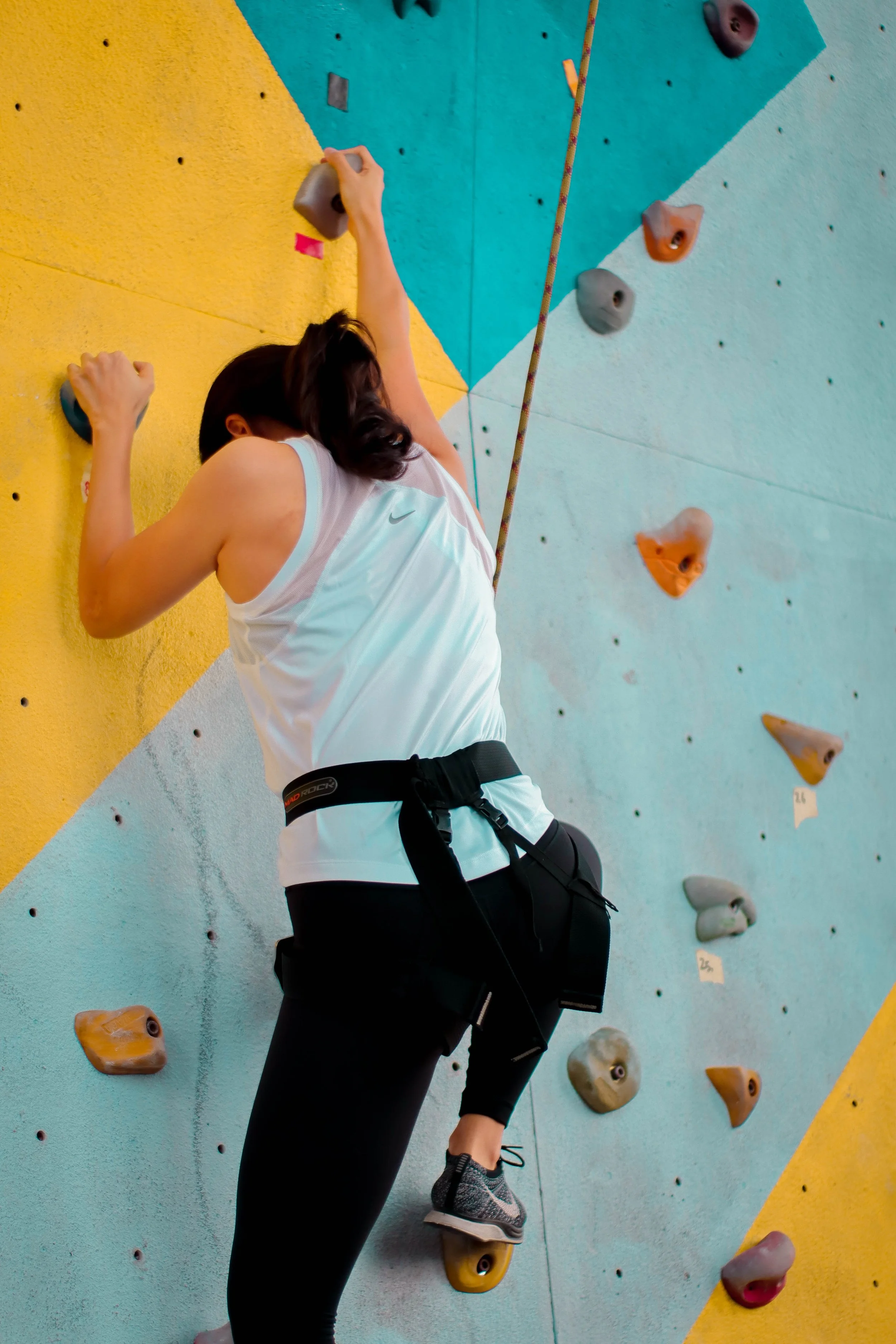
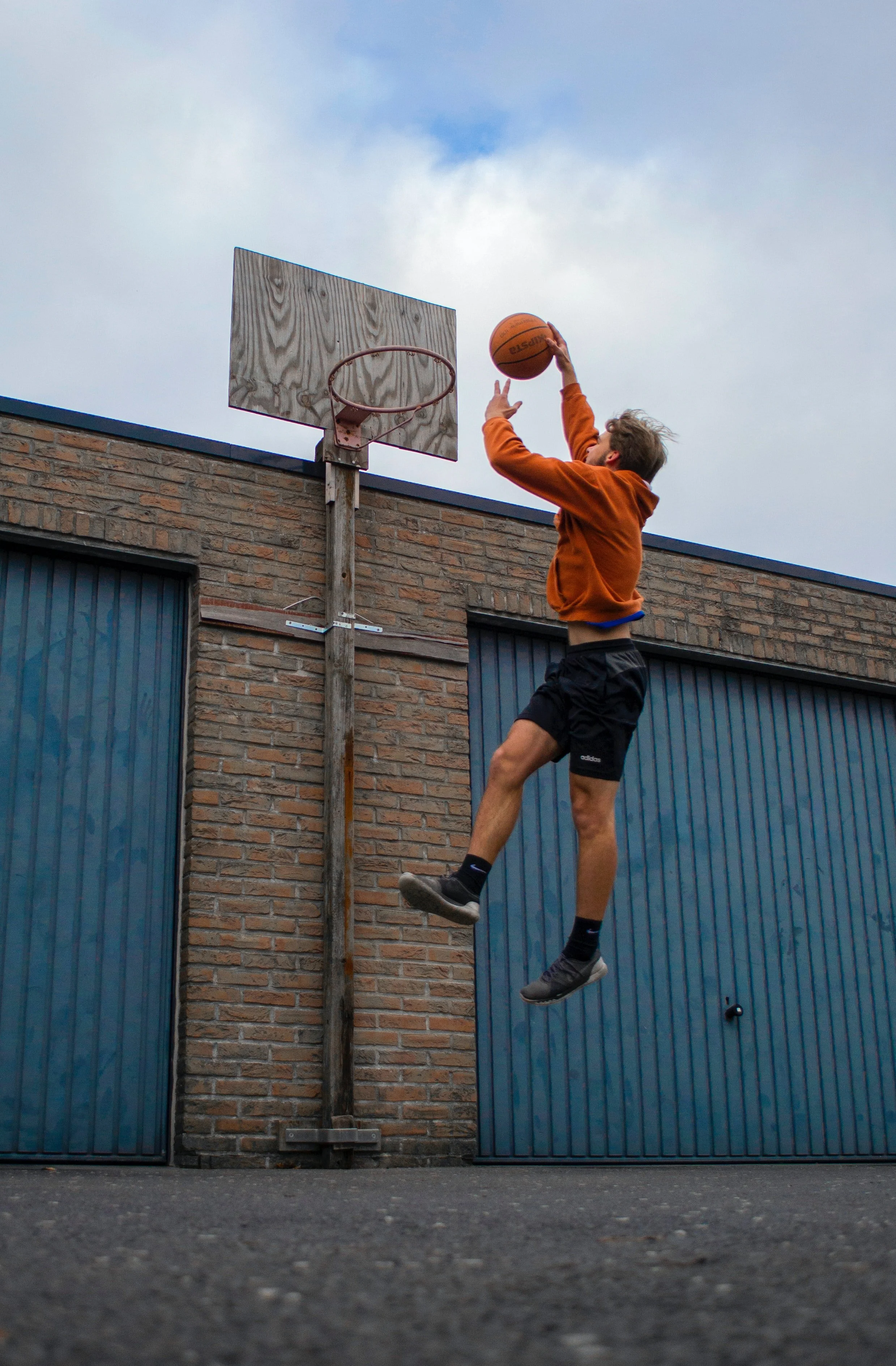
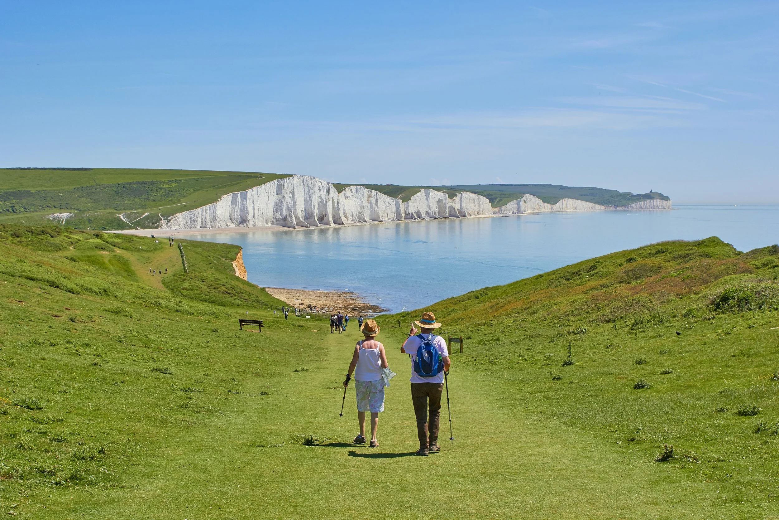
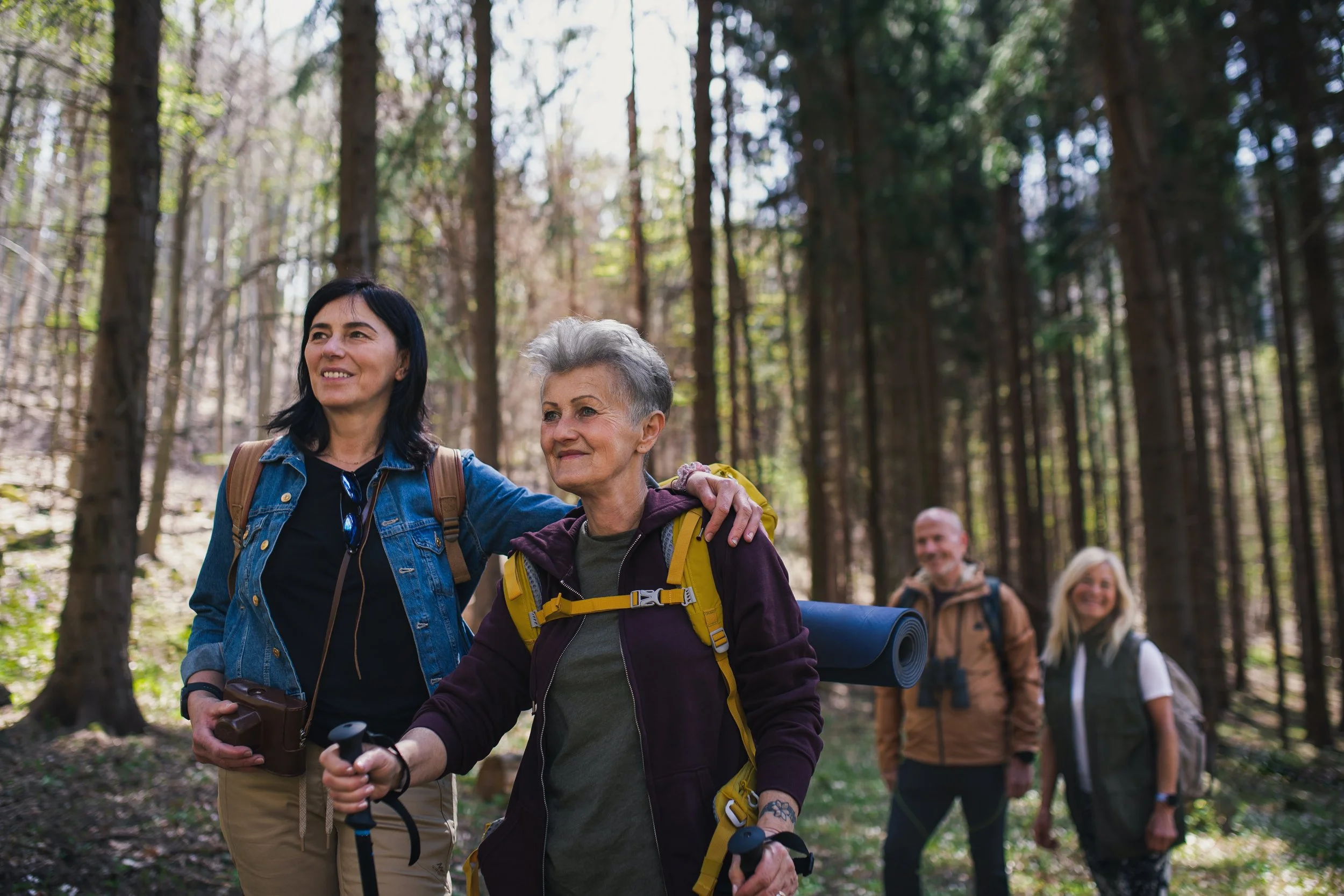
Giving individuals lacking either community or others who share in their hobbies and passions the ability to create, search, and join local group activities.
Overview
-
Initial Research
Competitive Analysis
User Interviews
Personas
Flows
Wireframes
Prototyping
Two Rounds of User Testing
-
Alissa Brimeyer: Project lead, lead designer, lead researcher
Insights and advice from Meghan Lazier's Fall 2022 Capstone Development and Presentation class
-
Figma
Mural
Illustrator
Google Drive
Zoom
Otter.ai
Calendly
Asana
The problem
Noticing widespread loneliness and social isolation, I became very interested in why so many people have this problem.
After much research, I zeroed in on the proximity principle. The proximity principle states that people are more likely to form a relationship the closer they are physically. This phenomenon is seen in dorm room proximity of college students, desk distance of work friends, and home distance in local friends.
With the rise of remote learning, working, and an emphasis on a healthier work-life balance, people want to put more time into their hobbies, but they need to be physically closer to people to do that. This project is tackling that problem.
Some main problem points from initial interviews are as follows:
People in transitional life phases seek out (and struggle to find) others.
People aren't sure where to start finding friends.
People prefer others in similar life stages as them and easy, safe, low-pressure starting interactions.
There are few opportunities for people seeking out friends that want to avoid direct rejection on friend-finding apps that require swiping and 1-on-1 messaging.
The audience
There are many groups of people that are dealing with a lack of proximity to others, but we will focus on optimizing the app for three groups that are likely to experience this problem:
New Movers: People interviewed frequently mentioned their fear of moving and having no friends or how moving in the past impacted their ability to find friends.
Retirees: New retirees consistently referred to filling their newly found free time as daunting, and social isolation becomes more likely as retirees age.
Young Adults: Young adults are most likely to make significant lifestyle changes, move locations, and find new hobbies and interests, making them need access to new people more often than other age groups.
The competitors
Some apps attempt to solve this social isolation problem, but with differing approaches. We learned what worked and didn't from their attempts to solve this problem. Here is a quick overview of some of the apps:
Initial interview insights
User interviews were conducted to get a deeper understanding of these problems within our chosen audience and to figure out which solutions could be most viable for them. As a result, an affinity map was created, which can be viewed below, along with five main takeaways that led the ideation phase.
The research
Additional research was conducted by reading articles and listening to many, many podcasts with psychologists. Here are some of the most interesting points that drove design thinking:
Community is necessary for healthy individuals and promotes creativity and empathy, yet we are becoming increasingly isolated.
The lack of access to community leads to increased rates of misinformation, division, and extremism as algorithms take over the information people are shown instead of exposure to a broader variety of people and ideas.
Most people don't enjoy the idea of small talk, but they report feeling positive about the experience after. People are also more likely to start engaging with each other if they feel their discussion has a specific purpose.
We have less practice facing rejection than people used to with technology intermediating our interactions. Allowing people to practice facing rejection in a safe environment with little to no consequences will enable them to face rejection on a larger scale more confidently later on.
The goals
Increase access to group activities.
Increase access to people with specific interests and hobbies.
Increase the rate of in-person interaction within communities.
Encourage healthy activities and habits, both socially and physically.
Decrease the rate of negative health effects from lack of community and social isolation.
The persona: The new mover
Goals
Meet new people
Create new healthy routines within their new surroundings
Become active in the community
Needs
Find friends
Find access to their hobbies at their new location
Increase their community engagement
Become acquainted with their new location
Pain points
Difficulty meeting new people with similar interests
Difficulty establishing close relationships
Difficulty finding people to go to community events with
Does not know places or opportunities in their new location
The persona: The retiree
Goals
Find ways to fill their increased amount of free time
Find new hobbies/activities to engage in
Manage their new schedule
Prioritize their comfort and safety when meeting new people
Needs
Access to people who are also retired with similar interests
Access to facilities and objects required for trying new activities
Communicate with others in a comfortable/familiar way
Pain points
Current friend-finding apps contain mainly young adults
Difficulty planning between other's schedules
Differing social engagement styles from current meet-up apps
Differing safety standards from current meet-up apps
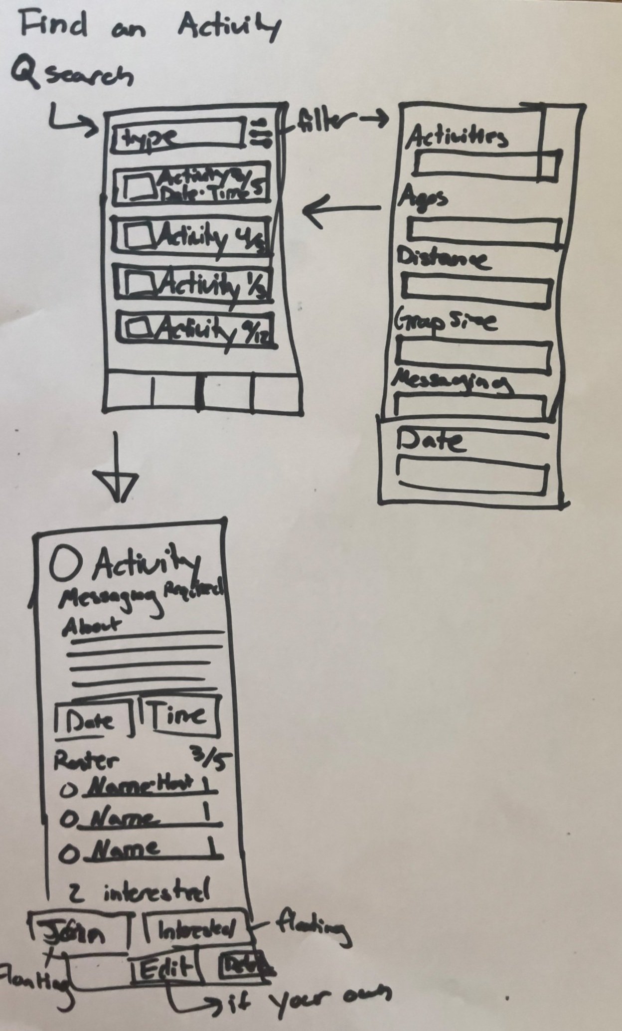
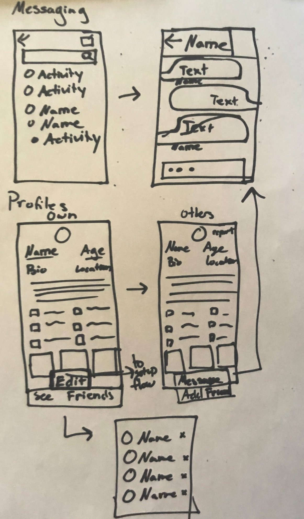
The sketches
A series of sketches, ideas, and flows were created to process this information. Here are what those looked like:
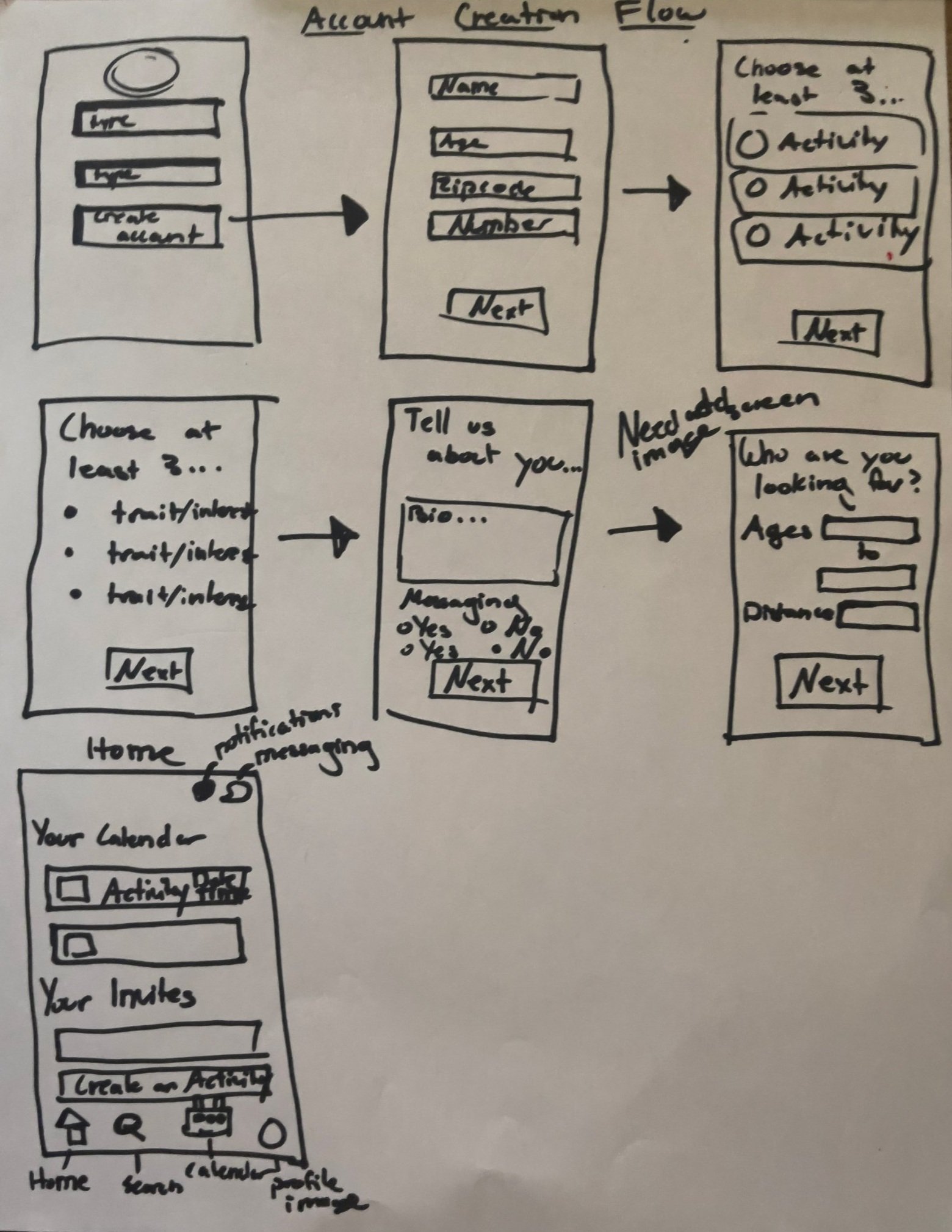
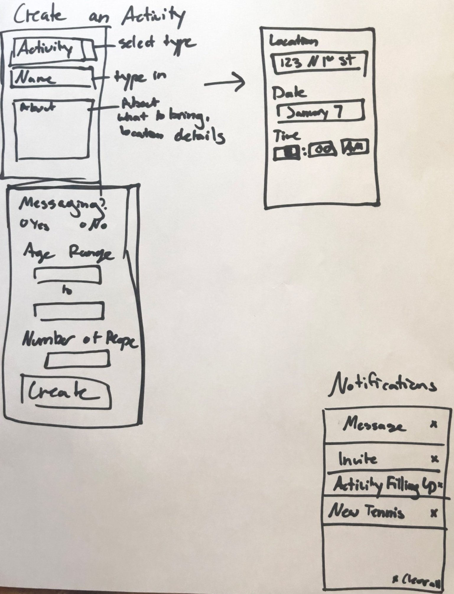
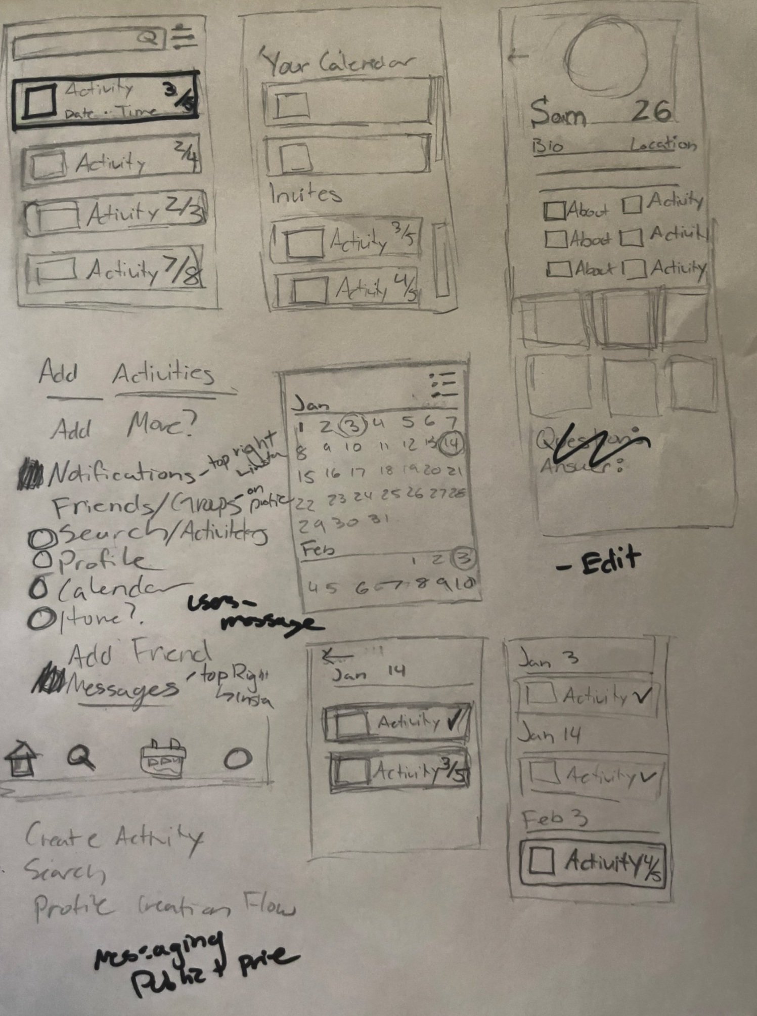
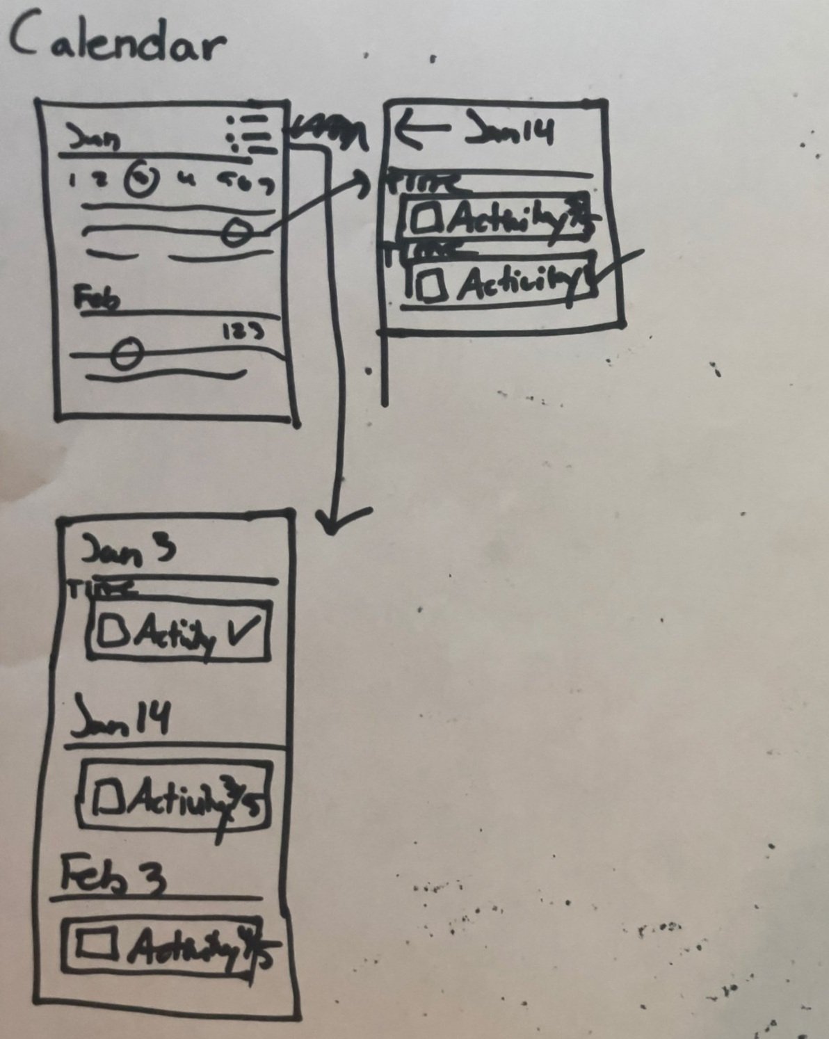
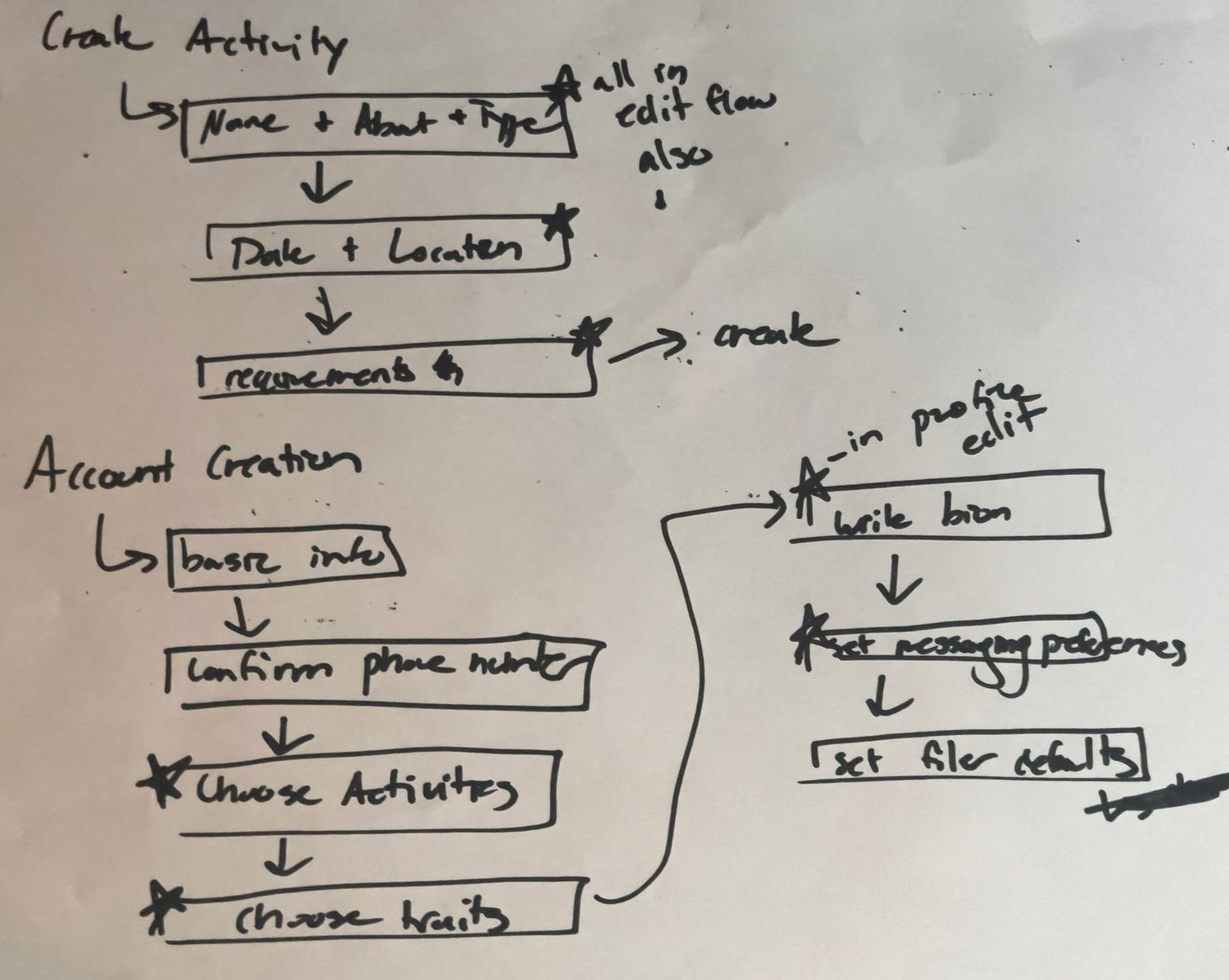
The initial flow
The brainstorming sketches led to deciding on the necessary tasks and features to include. Flows were created for specific goals and then connected into one application flow. Included are an account creation flow, a create activity flow, and an activity search flow.
Low Fidelity
The pages identified as necessary within the flow were then mocked up into wireframes and became the low-fidelity versions you see here. User testing with these screens focused on validating user needs and understanding how well the app met them.
The account creation flow was created first with the goal of setting expectations for the entire app and gathering necessary information. The initial flow shows how these screens began as a minimal way to collect information, but people didn't know how to expect the information to be used and weren't sure how to best fill out the forms based on their intentions making people hesitant to move on to the next step. Explanations, a more evident progress bar, and information about the app itself allowed users to move through these steps with ease.
For activity creation without hosting, some ideas brainstormed were having the app create activities or allowing a large group to form and schedule as they like. The resulting solution was to have someone create an activity, type the details, date, time, and a public location, and then they were free to leave the activity if they wished—making them more of an idea creator than a host.
Activity groups changed their name to primary activities – acting more as the users' filters and customization than an actual group. Users can search for any activity in their city, but their suggestions come from their primary activity groups.
User groups didn't like the pressures of messaging, but there was a necessity to communicate before a meet-up. This problem required more research, as I had to figure out why people didn't like messaging. What was discovered was that people felt nervous about interacting in a way that bothered others. So the decision was made to make private messaging optional, but group messaging open in each activity as it had a specific purpose.
The design system
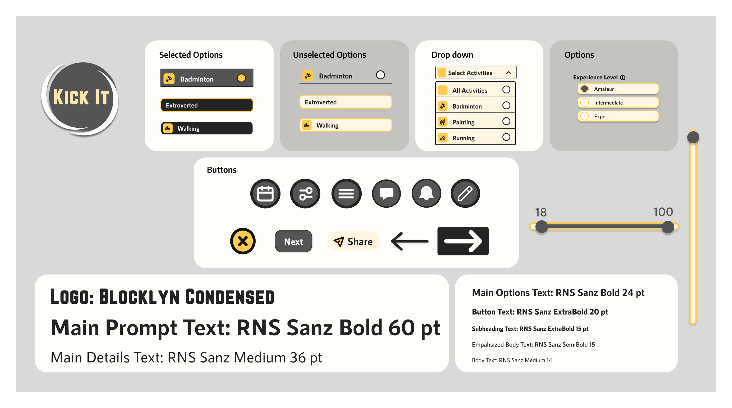
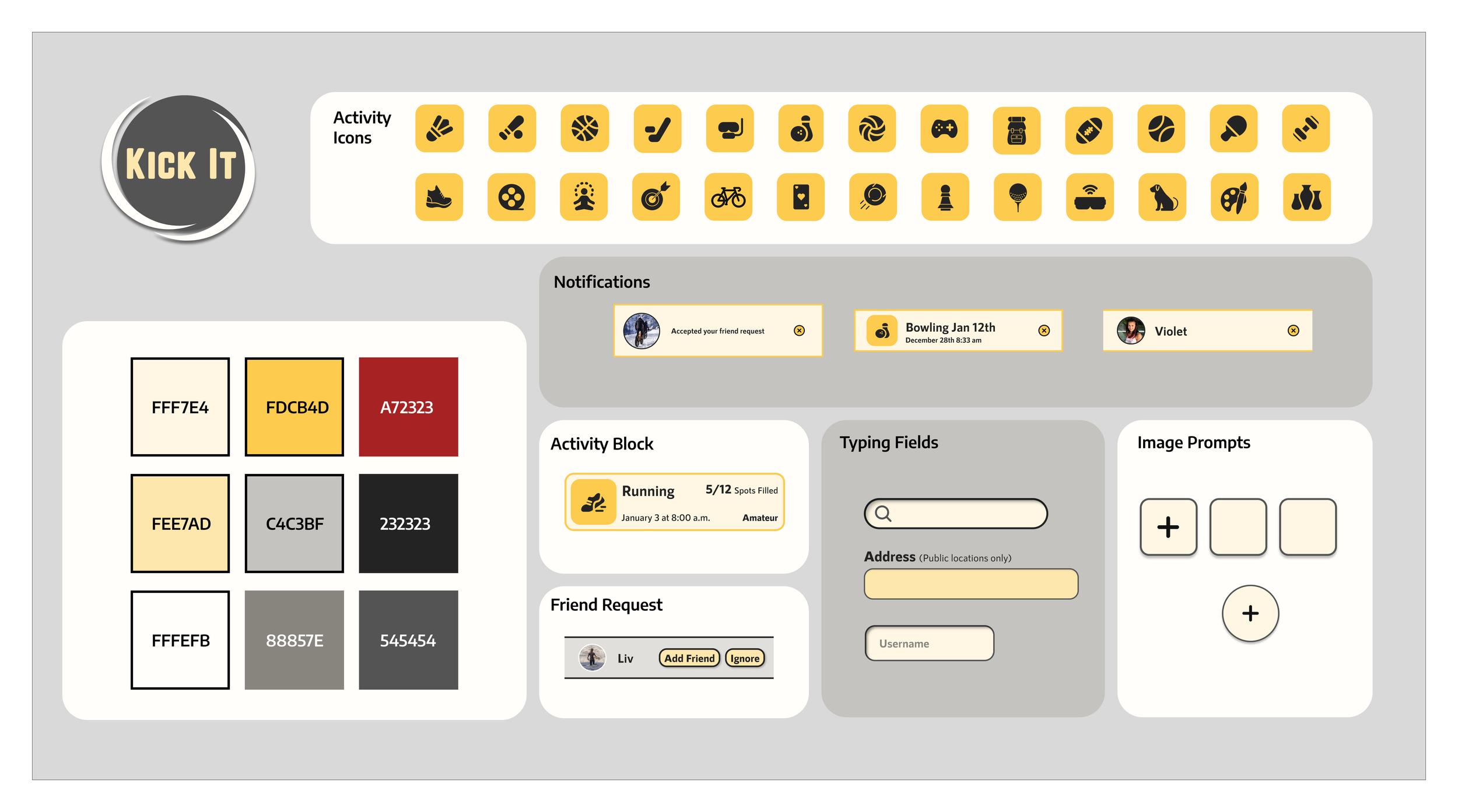
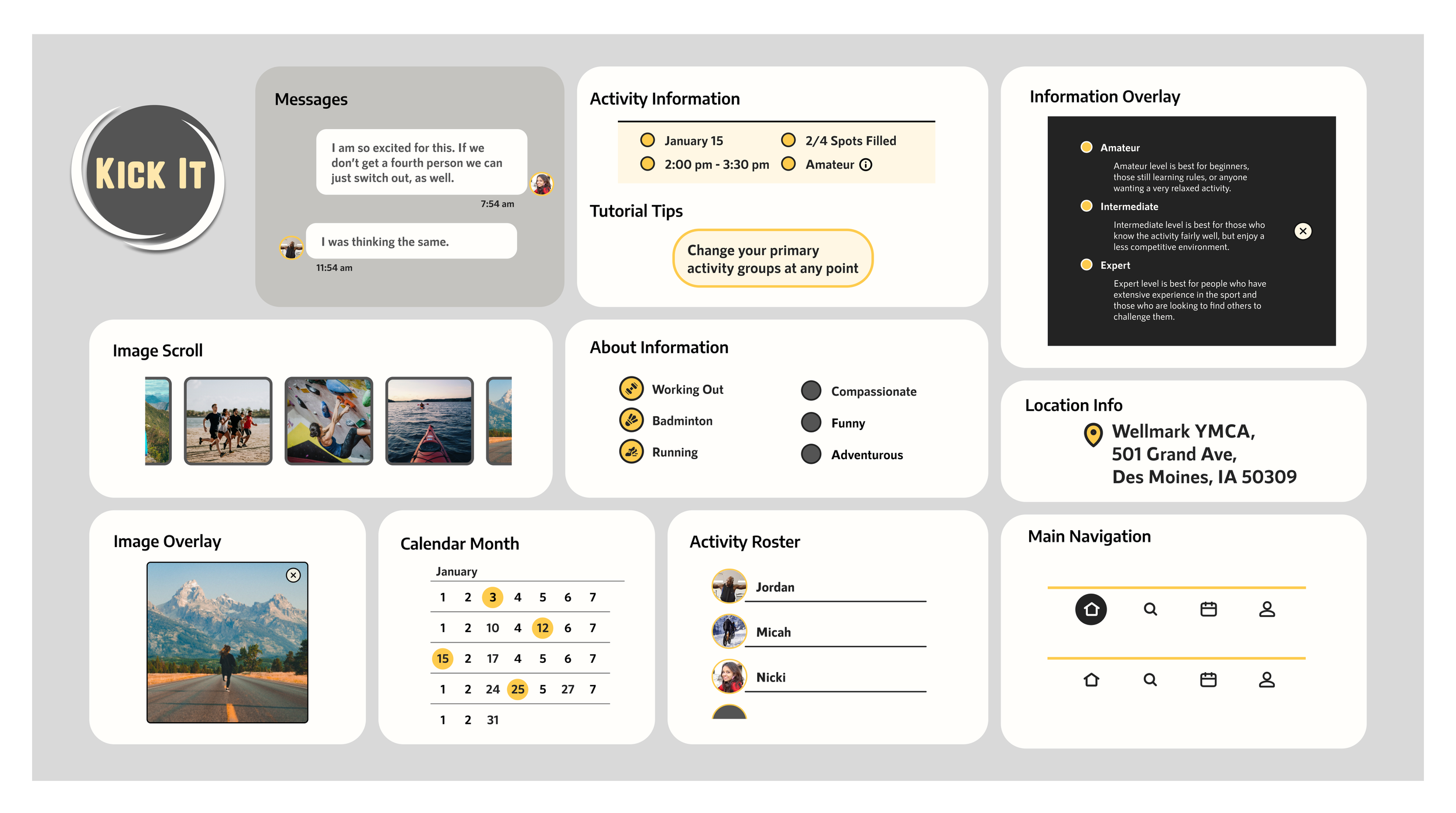
Once the low-fidelity wireframes had gone through testing to confirm the need for different elements and features, components, fonts, and colors were finalized. A simple color scheme of yellows and neutrals, prominent icons, and big simple shapes were prioritized to create an accessible and clean look.
Medium Fidelity
The colors and components were added to this medium-fidelity prototype, and the testing focused on assessing how well the app accomplished the original goals.
Profile management was a focus as the profiles needed to contain information about others to quell safety fears while feeling as though it wasn't too intrusive for more reserved users. We achieved this by having an optional short bio and additional images and publicly displaying the traits and activities of the user, all from a predetermined list.
Activity creation was expanded upon, and one common question throughout testing was what exactly classifies as an activity. This was clarified by simply removing the option to create an activity name and placing a dropdown activities list to name the activity. It made creating an activity almost entirely laid out as a series of options, with the only exception being a details box. This was successful in making people feel more comfortable creating an activity.
A need that was identified was the need for an easy way to manage and remember these events. This was especially necessary for recent retirees still figuring out how to manage a new schedule with more freedom. As a result, a calendar page was created to encourage people to sign up for various activities, as they don't have to manage them themselves.
As the app is differentiating itself from other apps focused on creating one-on-one friendships and is instead activity-focused, the friend pages had to be adapted to fit this need. Instead of getting updates from friends or having a feed, the user's friend list acts more as a reference. They can invite these people to activities, message them, or view their profiles, encouraging them to get to know each other better through activity meet-ups.
High Fidelity
Final tweaks and questions were challenged and answered in user testing until a learnable, usable, solution-focused app was in place.
The need to share activities with friends lists in an easy, pressure-free way became very obvious through testing. On the activities page, a button appears that allows people to send the activity to someone on their friend list in the form of a pre-written message suggesting that they may be interested in this activity. This allows deeper friendships to form from increased interaction while downplaying possible rejection with a less direct approach.
Throughout testing, it became clear that there was a need to make group messages seem less intrusive. It was decided that the messaging, including past messages within the group, would open up once the activity was joined. It made the interaction feel more like opting into a public forum rather than being placed in a private room.
The homepage was finalized towards the end of the project as features changed and buttons moved. Upcoming activities, filtering through main categories, and creating a new activity were the key features that needed to be represented. After those were placed, the messaging and notifications went to the top right, mimicking most social media apps for easy learnability.
The final major decision concerned what to do about groups that didn't fit the required number of people for an activity and what to do about people who didn't show up. Those two problems came together into one solution. For activity groups that did meet the minimum, a prompt for an activity review appears on the home screen after the meeting time. The prompt allows users to report if everyone who joined showed up. If someone misses multiple events in a short time, they can only join activities once the minimum group number has been reached.
The main flows
The interaction flows you see below show some significant challenges that were overcome. Figuring out how to create these cohesive flows was paramount to making the app accomplish the goals set out before us.
-
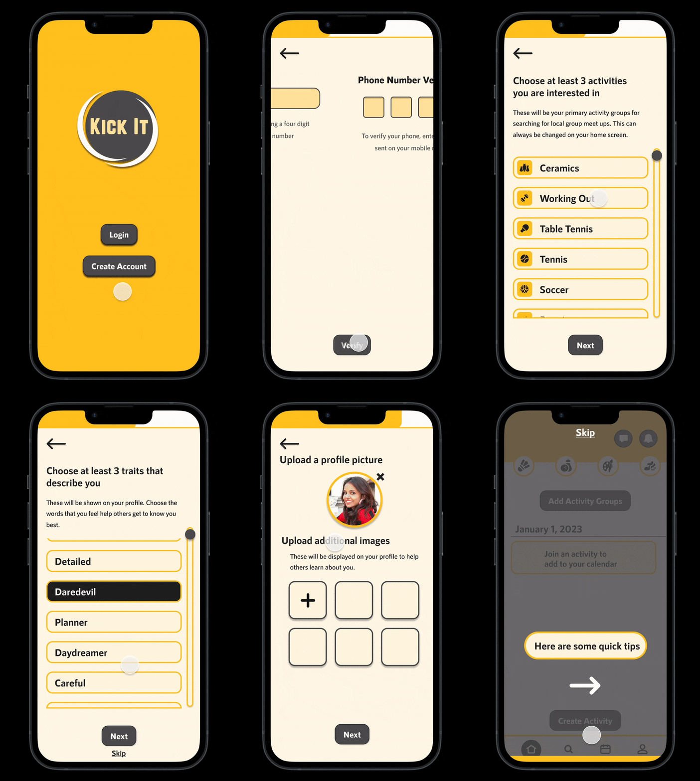
Account creation flow
This flow is the result of making the account creation better at setting expectations and reducing anxiety in users by gently guiding their decision-making.
-
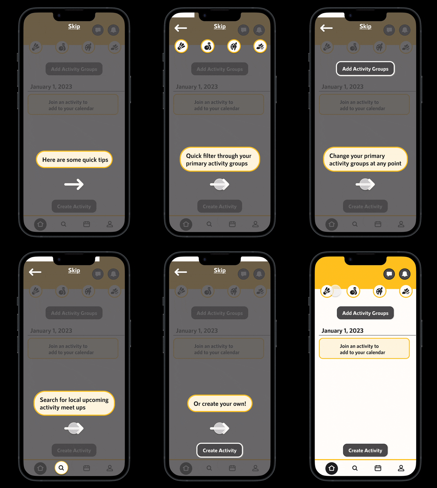
Tutorial flow
After account creation, users felt significantly dropped off right into the app. So this quick tutorial was created to bridge that gap and center people on their homepage before they start joining and creating activities.
-
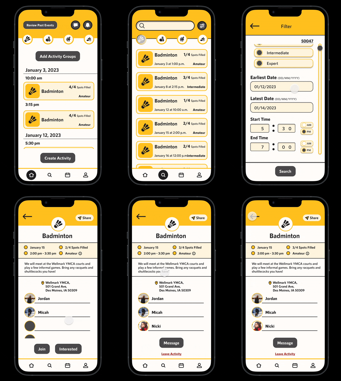
Activity search flow
The improved filters, the simple yet comprehensive activity pages, and the ability to share an activity with your friends allow the search for an activity to feel as private or public as users would like.
-

Activity creation flow
This flow brings together the two goals of avoiding the hosting dynamic while allowing users to feel in control of their options within the app.
-

Review activity flow
In this flow, users can easily report anyone they had an activity with and are only directly asked if the other users showed up. This centers safety and accountability without the stress of having others rate you.
The prototype
Here is the final prototype on Figma. Click through and explore to see the design answers we came up with!
The next steps
In the future, the central focus will be building out more activities. Currently, the activity options are pre-set, but a page for suggesting new activities was created to determine the most wanted activities.
Another related feature that needs to be researched and designed is the ability to find location-specific activities, such as surfing.
Currently, the app is local-community-focused. An option for managing multiple locations temporarily for people that travel full-time or want to do an activity on vacation needs to be explored.
One area to explore is the possibility of companies entering and hosting activities for users, such as hiking, yoga, and archery.
Allowing companies/locations such as movie theaters, sports clubs, golf courses, and painting studios to promote themselves on the app as locations is something to expand on and see if there is a market for.
The lessons
One major lesson learned throughout this process was the necessity of testing and retesting until solutions become clear. Forcing solutions only moves you further from the goal.
Another lesson was the importance of finding an abundance of information and then talking it out. Working through the problem and understanding the different strands is much more efficient than trial and error.
A third lesson was the importance of managing time well. Because of the research done early on, the brainstorming, and the early prototyping and testing, I expanded the app to fit users' needs in a way that I wouldn't have been able to do without a schedule and set goals.
The final lesson was being committed to finding a solution to the problem and allowing the process to take you where it goes, not finding the problem that fits your predetermined solution.


